Surface Design
The Ultimate Guide to Picking the Perfect Wallpaper
Picking the perfect wallpaper for your space presents a unique challenge. Unlike a coat of paint, wallpaper is a bold design statement and something that you want to use to uplift and enhance your space for years to come.
First of all, what really is “perfect”?
Well, it’s mostly down to personal preference and what you consider to be the best match for the space you’re trying to style. However, this doesn’t mean you shouldn’t seek some advice before opening your wallet for new wallpaper.
You need to think about the space you are wallpapering. Is it residential or commercial? Is it a bathroom, bedroom, kitchen, lounge, restaurant or hotel lobby? Which colours, patterns, and designs should I pick? And when it’s printed, which kind of material should I choose?
It can be hard to know which underlying tips to keep in mind when picking a wallpaper. So, we’re here to help! With a range of easy points and tips to consider while picking the perfect wallpaper for your space.
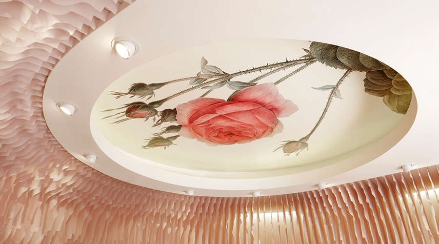
The light in the room
One of the best initial considerations to keep in mind is how much natural light the room you plan to wallpaper receives during the day. Whether it’s a lot of natural light or if it’s a south-facing space that struggles to see the sun, consider the mood created by the presence or absence of light.
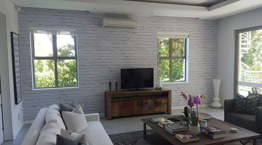
If a room receives a lot of natural light, it could be wise to stick with lighter, brighter colours to accentuate a lighthearted, uplifting atmosphere in the space. It’s also great to consider matte wallpaper instead of printing on a reflective surface.
In a room with a lot of natural light, reflective wallpaper will have a noticeable sheen, that can draw attention away from the design or artwork depicted on the wallpaper. The reflection can also be irritating to some, and thus a matte wallpaper that showcases your wallpaper design just as it was intended, would be a good idea to use.
For a dark space, it’s good to incorporate a wallpaper design with some vibrant colour that pops out and catches the eye in the dimly lit space.
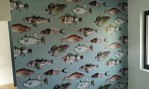
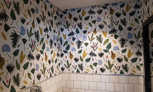
Especially with bathrooms, access to light can be a serious problem. Many people solve this by sticking to a white colour scheme suck as four white, tiled walls, however, you may want to think about adding some colour to the space to avoid it being bland and boring.
Just like these examples above, you need a background that has a more placid hue, whether it’s a light tone like white or cream, or darker tones like dark blues, purples and black.
Having a more neutral base colour allows for illustrations within the design to jump out and speak for themselves. Using a nature styled theme with brightly coloured plants, fruits and veggies can create a funky feel for the bathroom. Alternatively, having fish forms in the foreground is intriguing too.
The detailed nature of a fish – its eyes, scales, small fins and its overall shape – catches the eye immediately. Coupled with the brighter colours used for the fish forms, the eye will connect with the foreground whilst the placid coloured background appears to recede. This creates a perception of depth, which is useful particularly in smaller spaces.
Let’s find out about some other ideas for using colour to portray a particular effect or atmosphere.
Picking colours for your wallpaper
Colours are an important consideration when it comes to wallpapering a space. Colours have certain psychological connotations, and create different atmospheres in a space, depending on the range of colours used. Before getting down to selecting colours that might not fit your original vision for the space, consider some of our tips.
First, think about the function of the room. Is the room a personal space? Is it shared? And what usually happens in the room?
For example, if this space is your lounge, somewhere you entertain guests while you share drinks and snacks – you may feel an appropriate colour palette would be one with brighter colours that creates a lively energy in the lounge.
Alternatively, if the room is purely functional, like a kitchen, you might consider colours that are more placid and calm. A kitchen might already be a really busy space, and using washed colours like eggshell, beiges, and cream tones work well to taper the movement in the space and bring balance.
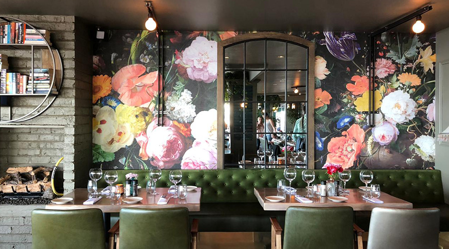
For business spaces, such as restaurants it’s likely you’ll style this kind of space relative to a theme you’ve selected and the style of restaurant it is. Often a bold print, unique artwork, or unusual colour palette is selected to create a bespoke and memorable aesthetic.
Restaurants will also often pick wallpaper colours to represent food, such as the tones present in a succulent salad, with greens, reds, oranges and yellows.
The same can be said for morning eateries who tend to use light, vibrant colours to energise customers in the morning.
The colour yellow specifically, can also be used in bars as psychologically we find the colour calming. This helps to have around a bar where there’s alcohol and energy to keep customers calm and amenable.
Premium fine dining restaurants on the other hand often include rich, alluring colours and stunning imagery that catch the eye in an elegant, seductive fashion. Artworks often include floral forms, like roses, with light creams and contrasting dark reds and greens.
We have some really valuable tips for wallpapering your restaurant here with some great examples to grab your attention.
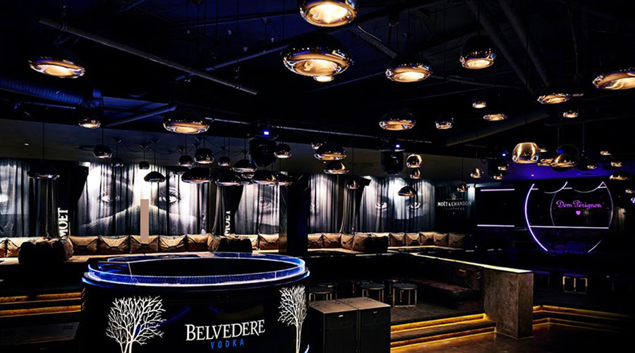
Similarly, nightclubs and premium bars will often include large artworks and wallpaper displays. The finishes surrounding these artworks usually represent a regal, high-class feel. In terms of colour, these include silver hues and gold.
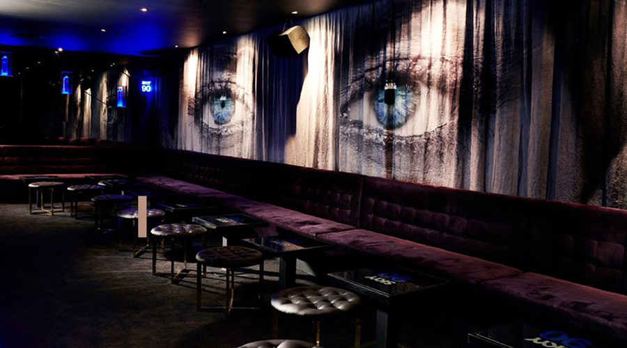
It’s also popular to see the human form depicted in some way in nightclubs and bars. This usually involves striking images of the eyes, for example, which could be seen as relating to the scope of the current generation and the need to be (or feel) seen.
Abstract artworks also create a busy impression in a nightclub, and something that resonates with your audience or creates movement can help increase energy within the space.
Now, let’s see how we can maximise a room’s visual appeal by using the height of the ceiling as an advantage.
The height of your room’s ceiling
This is sometimes overlooked when you first assess your space and wonder which wallpaper would work really well.
Your ceiling height should be an important factor when choosing your wallpaper. Low ceilings create a space that feels smaller, in which case, it’s better to go for a colour and/or pattern combination for your walls that creates space.
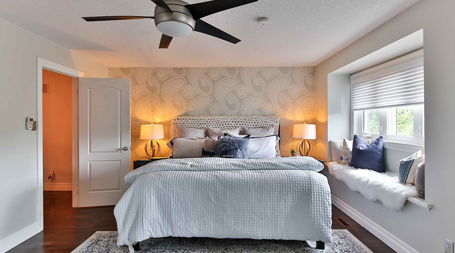
Keep in mind (that if you decide to use a pattern) try to use something that has some negative space and isn’t so busy that it’s overwhelming.
In terms of using colours to create space, lighter colours would work better than darker tones. However, choosing a pattern that combines a dark background colour and elements with vibrant, lively colours in the foreground – is a great way to create space.
This is because the eye is drawn to the brighter colours on the surface, while the darker tones recede into the background. This creates an illusion of depth and makes your space feel larger.
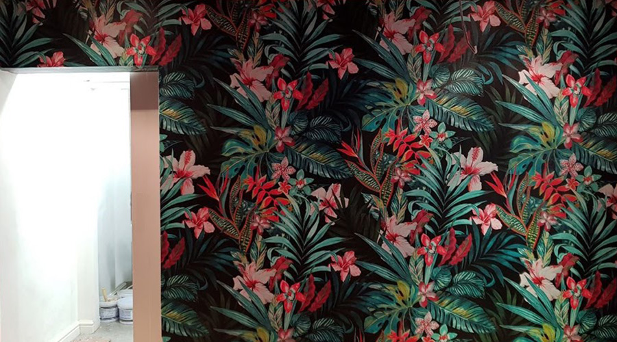
For spaces with high ceilings, the sky’s the limit! Maximise the extra space you have to create something engaging or harmonize with the overall theme for the room. High ceilings mean more wall space to create an atmosphere of your choice.
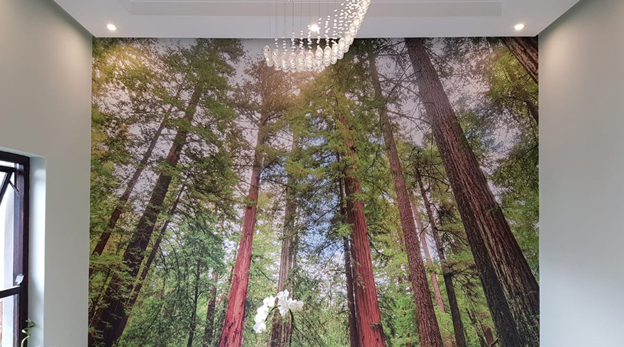
A good idea when maximising the space that high ceilings create naturally is using images and patterns that use the vertical plane effectively.
Having tall trees, as in the examples above, and other decorative elements in your wallpaper design that extend upwards and a draw the eye towards the ceiling will help create the perception of even more extra space.
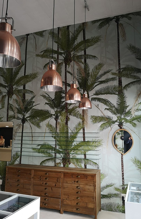
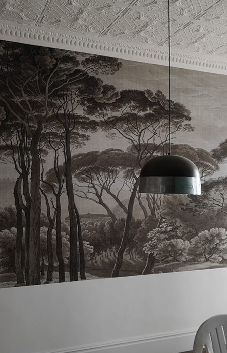
Similarly, hanging curtains (or other decor such as paintings) from the highest point possible, will help amplify the endless space effect that you aim to achieve. Hanging light fixtures are also more useful in this scenario than lights that are flush with the ceiling, and create a bubble effect on your ceiling.
Incorporating lights that hang down from the ceiling long cords and create depth, will be an asset. This style of lighting will amplify the appearance of space and harmonize nicely with the use of the vertical plane in your chosen wallpaper design.
Picking wallpaper for your ceiling
Don’t forget about one surface that’s normally overlooked – the 5th wall.
The 5th wall? Your ceiling of course! Usually, the ceiling is underutilised when wallpapering a space. It’s a more popular approach to only stick to wallpapering 4 walls in your space, but using the ceiling to your advantage can really help.
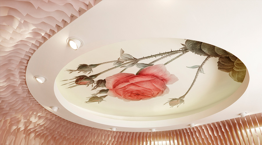
It gives you a space to continue conveying your theme, or a featured space to try something different. You could even use it to disguise an unsightly surface finish or create the illusion of more space.
Maybe, you choose to use this surface as a featured wall and exhibit a fine art print. Alternatively, styling your ceiling might just be about adding a spark to a bland surface and accentuating your light fixtures.
Choosing patterns for your wallpaper
Patterns and repeating graphics can be a great way to add some style to your walls and create some eye-catching details that add a spark to any living space.
Choosing the right kind of pattern that adds value to your space, and doesn’t compromise on the atmosphere you’re trying to create can, however, be a challenge.

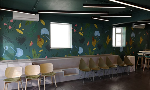
In a small space, it’s not advisable to have many walls with repeat patterns. Multiple walls with repeating colours and elements create a lot of movement. This movement results in a chaotic atmosphere, which when coupled with a small space, feels claustrophobic.
You could choose to have a featured wall instead. Take one surface and add your personal touch by picking a design that resonates with you, and contrast it with fewer patterns and calmer colours in a similar palette for the remaining walls in your space.
Also, if you think your pattern might be a bit overwhelming, try to offset it with a different style. There are multiple types of repeat patterns such as the half drop, diamond, block, stripe, toss or dot. Have a look at this article for an outline of how the style of each pattern is designed.
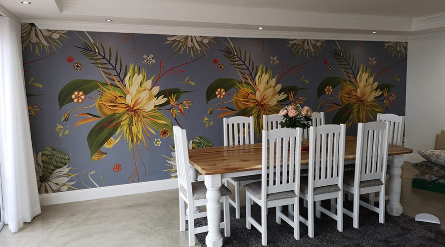
A large repeat pattern can also work well. Larger artforms that have repeating elements but also areas of breathing room can create a lengthening effect in your space. A darker background can help offset depth in the piece, and allow floral forms, in this example, to launch into the foreground with their vibrant range of colours.
Having a solid background and incorporating areas of space also allows smaller, detailed elements to catch the eye quickly, rather than overlapping smaller forms that almost look overwhelming and disruptive if layered and placed close together.
Consider the furniture in your space
The furniture and fixtures within your space can have a large influence on the style of your wallpaper and the impact it has.
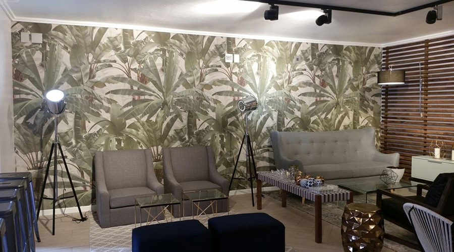
Initially, consider the proportions of your furniture. A space such as a lounge, with large couches or armchairs, might not be so suitable for wallpaper. This may be because large furniture will block a large portion of your wall, meaning you don’t get the full effect of the design. Especially if it’s an artwork and not a repeat pattern – elements of a piece can get cut off and this will ruin the eye-catching appeal you originally intended.
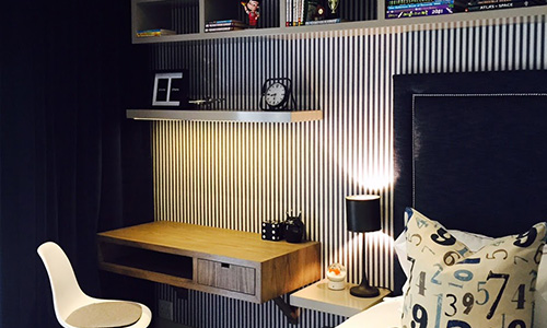
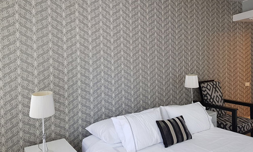
Here, a simpler and consistent pattern has been chosen and it works really well. This is because even though certain portions of the design are cut off, the pattern keeps its continuity and the furniture actually provides a nice break for the eye between the consistent vertical stripe pattern.
You could also go for a feature wall which isn’t occupied by a lot of furniture. This gives you the opportunity to add some style to your space and draw attention to a focal point in your room that adds atmosphere. You can complement this featured wall by styling other surfaces with colours that harmonize with your eye-catching featured surface.
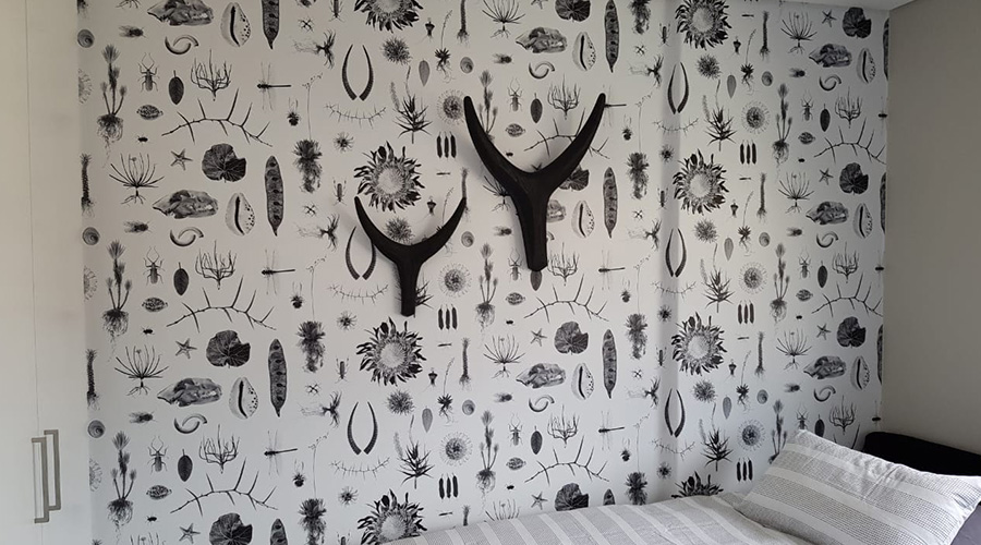
Such as with this nature-inspired wallpaper, it was decided to commit to the style of the wallpaper and add extra decorative elements, like the buck horns, to accentuate the theme the room conveys.
Even though some of the pattern has been lost behind the bed, it’s not as big of a loss when the eye is immediately drawn to the horns in the centre of the wall, rather than the edges of the wallpaper.
Similarly, in a kitchen setting it’s also best to consider your appliances and fixtures. Appliances like microwaves, kettles, ovens, dish racks, fans, and so on, will cut off parts of your walls and interfere with your chosen design.
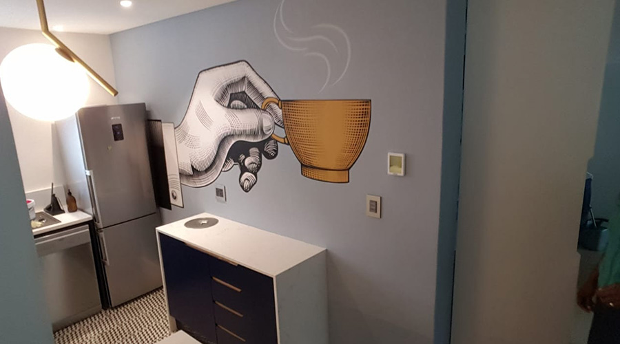
Considering your fixtures, and their colours, such as handles, drawer knobs, and the colour of your cupboards and equipment within this space can be used to your advantage.
Here, it’s best to select colours that harmonize with the types of fixtures you’ve chosen. Try not to work against the colours already present in your kitchen space, and instead use them as a guide to spruce up its style.
In the example above, the fact that the fridge will cover part of the wallpaper is something we’ve leaned into.
Instead of having an artwork cut off because of an appliance we decided to use it as an opportunity to create a point of mystery. The sleeve appears from somewhere behind the fridge, while the artwork showcased extends to cover the main, open segment of the wall.
Consider the wall itself
Another important consideration is the wall you wish to apply the wallpaper to..
Having a window, or multiple windows, present on a wall that you want to layer with a stunning design can create problems.
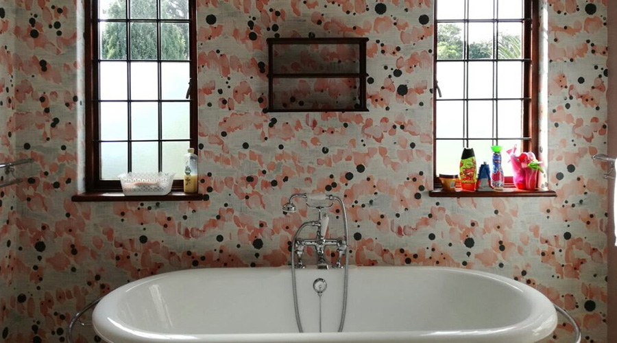
Printers and installers will often charge extra, as the original wallpaper printed to cover the size of your wall doesn’t include any window cut-outs.
It also means that portions of the design you plan to have on your walls may be obscured and might not look as good if there were no gaps in the graphic.
In this case, try and plan the pattern you choose to fit or mold around your windows, or make sure you’re comfortable with losing a portion of the design due to having to make cuts for the windows in your room.
How to deal with weird walls in small spaces
Having a small space that you don’t know exactly what to do with, can be an opportunity to maximise your creativity and apply something that looks amazing. Have a look at the examples below.
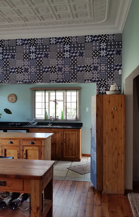
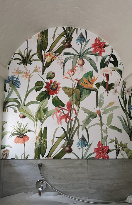
Small arches and leftover segments of wall left from knocking through a wall to create more room, such as with the kitchen image above, provide a blank canvas to add something that creates a bit of eye-catching style.
Leaving small spaces unused can make the atmosphere in a room appear bland, and stagnant. Adding a pattern or imagery that resonates with a part of your taste and personality, will create a far more enjoyable atmosphere in the future for whichever environment you’re styling.
You can also incorporate this idea with ceilings that slope downwards in a triangular shape. This shape often cuts off a portion of a wall and can make a space feel smaller and more claustrophobic.
In this scenario, you need to incorporate graphics, patterns and colours that will create more depth within the space. Have a look at this interesting effect we created for one of our clients.
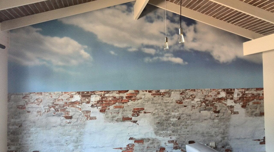
The sky was the chosen image used to create space in this slightly boxed-in environment.
Naturally, the sky has an endless open appeal and thus as a theme it works really well to create the perception of endless space that extends beyond the roof and wall of the space.
We also contrasted the natural sky with a raw brick face to create a rustic appeal that is attention-grabbing. The brighter tones used in the image of the sky are lighter than the latter half of the wall.This creates a feeling of space for the top half of the wall, as it leads to the natural shape of the ceiling.
Another space that is often underutilized is walls that surround staircases. This is a space that transitions people from one space to another, and we often leave this blank canvas open.
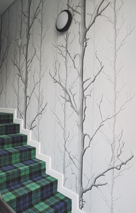
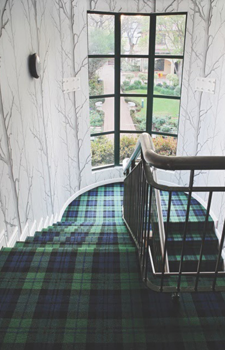
Of course, stairs, handrails, glass and other materials that form part of the design of your staircase, can obstruct paint and graphics – but using the right technique and graphic can enhance the appeal of taking the stairs.
Like this example, a pattern that is constructed vertically instead of on a horizontal plane can be far more effective. This creates the perception of movement in an upward direction, which harmonizes with the nature of taking steps to get to a higher floor/position.
Having a vertical repeat pattern also creates space, as the pattern is elongated and extends upwards, creating the illusion of greater space on a vertical plane.
Different wallpaper materials & what’s best for your space
There are a few materials to choose from when wallpapering a space.
More commonly, you have textured and smooth wallpaper. Textured wallpaper can be used to add an element of detail to complement a pattern or artwork depicted.
A smooth wallpaper often looks cleaner and more refined, but it really depends on the setting and mood you’re trying to create.
In terms of choices of materials, you have vinyl coated wallpaper and solid vinyl wallpaper. The difference between the two?
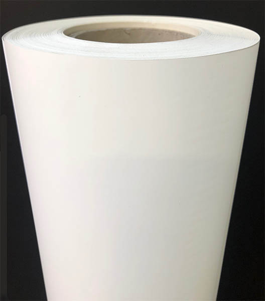
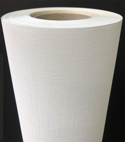
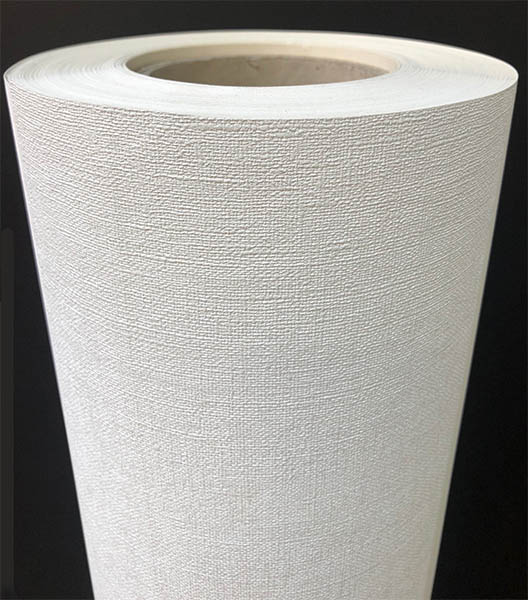
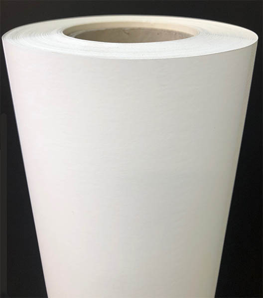

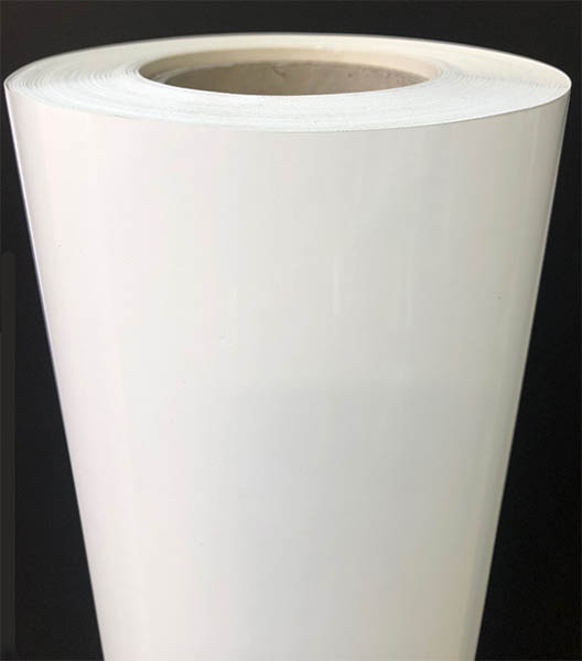
Vinyl coated wallpaper, which is backed by paper can be difficult to clean effectively when a scratch occurs and involves a delicate hand. However, the accurate reproduction in colour quality is what can make vinyl coated wallpaper a winner for some.
Solid vinyl wallpaper is a better choice for areas of residential or commercial space that experience moisture. Solid vinyl is not backed by a paper foundation and is easy to clean without damaging the design.
You can also choose between a gloss or matte finish to match with your space and the light it receives. A matte material will perform better in a room with a lot of natural light, whereas a gloss finish will look great in a space with less artificial and natural light.
We offer prospective clients a range of finish choices to help them display a stunning design. We believe in a PVC free approach to wallpaper, and choose a material that’s 100% recyclable and print our designs with non-toxic latex ink. These include:
- Matt smooth: Smooth mottled texture.
- Canvas texture: Elegant woven fabric, softens reflection and striking prints.
- Ritz canvas texture: Shaggy fabric texture, similar to rough linen.
- Paper finish vinyl: Smooth matte satin finish. Low sheen and soft to touch.
- Matt vinyl SAV: Self-adhesive based, satin-matte finish suitable for smooth surfaces.
- Gloss vinyl SAV: Self-adhesive based, smooth wallpaper with a gloss finish.
Have an in-depth look at the materials we have on offer here and see which style will suit the approach you’re going for. This detailed breakdown will also allow you to understand the stylistic and functional advantages of printing on certain materials.
Conclusion
To summarise, think about the intention behind adding stylish wallpaper to your walls. Consider whether you’re looking to create an effect, such as more space, or an atmosphere, such as a lively one, and which colours you can use to bring this idea across.
Think about whether you crave eye-catching detail, or if you need this space to feel personalised, and fitting to your character. Also, consider your theme, and which designs work well with the ambience you aim to create in a large or small scale space.
Each room is unique and we’ve developed a range of tips to help you style a variety of different spaces. Have a look at our other posts below to help you pick the best wallpaper for a bedroom, bathroom, restaurant or even a hotel lobby.
Contact our passionate team at Robin Sprong Wallpapers and let us help you pick the perfect wallpaper today!


2024 Wallpaper Trends: Handpicked Hot Collections by Robin Sprong
From bold patterns to subtle textures, we are taking a closer look [...]
Mar
The Top Interior Design Schools in South Africa
Interior design is an essential function in many industries – its purpose [...]
Mar
5 Pattern Design Trends for 2021
Are you looking for pattern designs that are going to be on [...]
Apr