Surface Design
How To Pick The Best Wallpaper For a Hotel Lobby
A hotel lobby or entrance hall is an important space that needs to be properly utilised to create an inviting, friendly and calm atmosphere for guests, upon entering a hotel. This can be a tricky task, with a lot to consider.
The interior design of your hotel lobby needs to be inviting to everyone, which means choosing universal themes that can resonate with a large audience – and don’t discriminate or create controversy, especially culturally, in any way.
Design & Colours
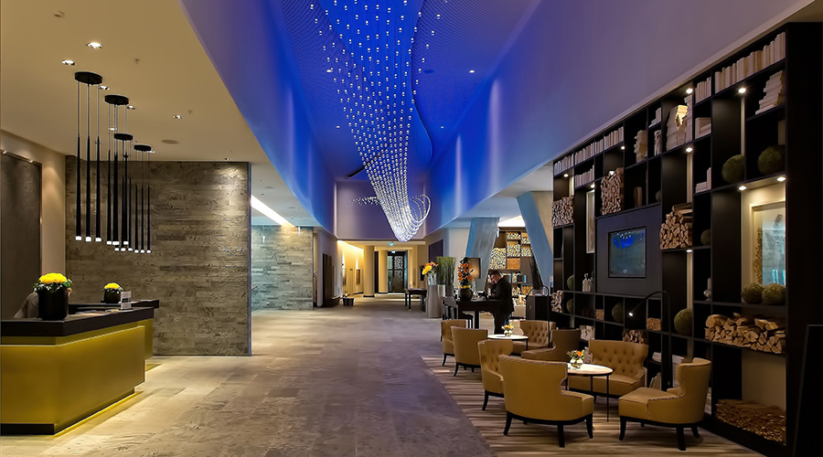
The type of hotel that you are decorating (whether it’s a mid-tier or upmarket hotel) will have a large influence on the interior style, colour palette and imagery you want to be showcased in the hotel lobby setting.
The chosen styling of the hotel’s interior will also differ depending on the rating or nature of the hotel. An upmarket luxury hotel will want a different feel to a small, eclectic boutique hotel or a mid-range family-friendly hotel chain.
Upmarket hotels, for example, focus on creating an all-inclusive environment by focusing more on the style and colour palette used in the interior rather than picking a certain piece of art to display on a feature wall. These luxury hotels will commonly use colours such as navy blue, oxblood red, deep copper colours, and rich, saturated opulent tones.
Using the contrast between gold and black or silver and black is also a common approach for high-end hotels as it creates a premium, sleek atmosphere in the main foyer of the hotel.
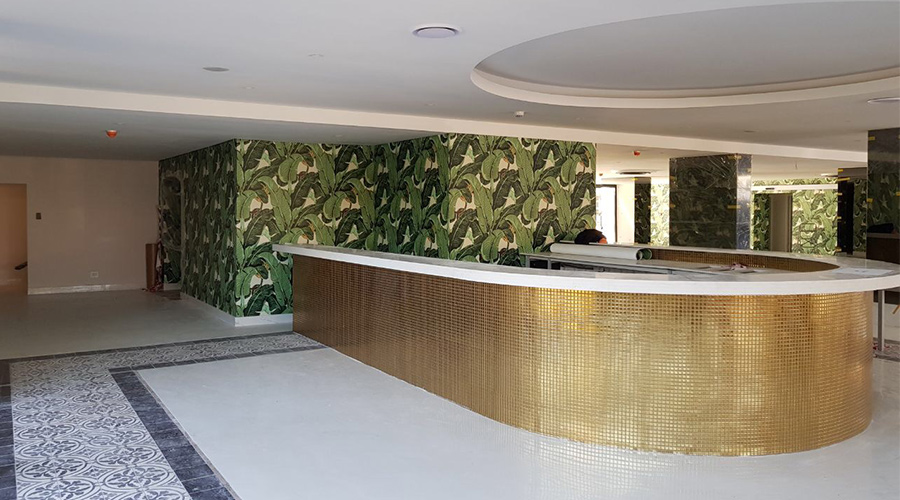
Have a look at this example of newly-installed wallpaper that creates a sense of luxury, winning the customer over and convincing him/her to book a room and enjoy the great service and enjoyable experience that the space has to offer.
As a result of these tones, the wallpaper used in higher class hotel establishment will need to match a more “regal” feel, which will need to carry through the colour palette into the wallpaper and repeat pattern, if chosen as an approach.
Mid Range, Local Hotels.
Hotels that focus on an affordable price point while still providing great rooms and service appeal more to a local audience. Theses hotels often focus their interior design, artworks and wallpaper around features of the local area.
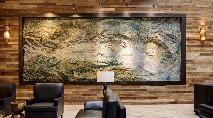
In such scenarios, maps are a popular option to visually showcase all of the featured spots, landmarks and important elements of a surrounding area or city, in which the hotel is located.
Having the interior walls of the lobby as a canvas allows you to show incredible detail while providing information that encourages tourism in the local area.
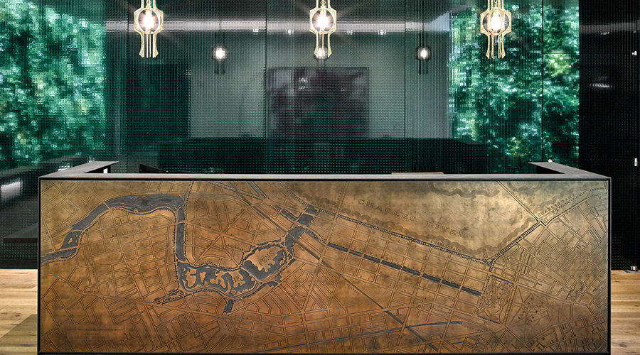
This can also encourage guests to return to the area in the future if they’ve found a collection of things they can enjoy there. Upon their return to enjoy the area, it could be likely that they become regular guests at your hotel.
Maps work well, but you’re also likely to encounter photography of striking landmarks, mountain ranges or spectacular views depicted within the wallpaper in the lobby of the hotel. This provides excitement about the local area and all it has to offer. It creates a sense of energy and motivation for visiting and is a great way to make an inviting first impression!
Incorporating a world map is also a good choice. This provides a sense of inclusion for visitors staying at a hotel from all around the world.
It’s also not uncommon to see clocks showcasing different time-zones alongside the map. This also creates a sense of intrigue that can keep your eyes and mind occupied as you check-in.
Top End or Luxury hotels
Some of the examples we’ve shown you so far, with upmarket hotels, include a warmer colour palette, with darker earth tones.
Now it’s time to delve into wallpaper designs for the interior of hotel lobbies with a more neutral, and peaceful colour palette – which can be contrasted by detail and darker tones of colour.
The location and theme of the hotel determine whether to opt for calmer, neutral colours for hotel interiors or rich, saturated tones as in the examples showcased.
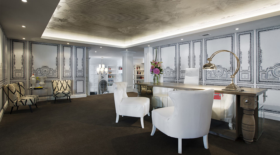
Although neutral colours may appear less exciting and luxurious, it is an important part of the luxury experience for a guest to feel calm and welcome in a space. The same applies to themed artworks and other intricate imagery that should be used sparingly and cleverly to avoid overwhelming guests.
Opting for a light colour palette can also be motivated by location and theme, and the Marly Boutique Hotel is a great example of this.
Based in Camps Bay, a rich, regal suite of colour tones might have not appeared as sleek and sophisticated in the context of coast. Instead, we created a wallpaper that uses neutral, placid colours and added aspects of contrast and detail that provide intrigue without disrupting the tranquil mood of the space.
Another trend is incorporating large artistic pieces into your wallpaper design.
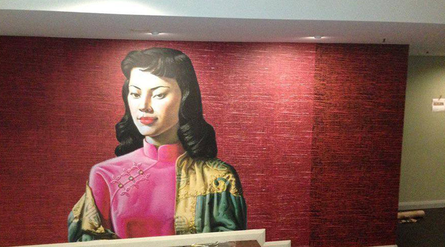
Artworks in Hotels
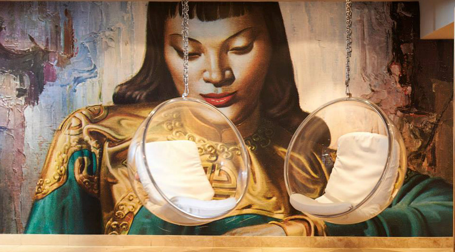
Another common and creative trend we tend to discover with high-end hotel clients especially, is that alongside our wallpaper design, they will most likely look for at least one featured wall or artwork that can be placed in the lobby.
Usually, this is either applied to the wall itself as wallpaper or mounted on canvas and attached to the wall with wallpaper in the background on the wall behind the art piece.
These kinds of clients usually have an artist in mind already, and if they’ve haven’t already commissioned a specific artwork from him/her, then they will communicate their vision to us and we will handle communication with the artist to deliver a dazzling final product.
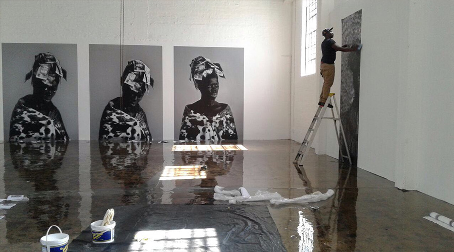
Working With Contrast in Neutral Palettes
We’ve shown you different examples of how hotels play with placid tones and darker hues, along with illustrative or decorative design to add a spark of intrigue – now here’s an example with a natural theme.
The use of neutral colours, such as light greys and cream tones doesn’t have to be as modern, sleek and staunch as the picture above.
You can work with nature as a theme, and contrast these placid tones with eye-catching beautiful illustrations. This will also create a relaxed atmosphere, as natural as a theme tends to calm us and create a sense of tranquillity.
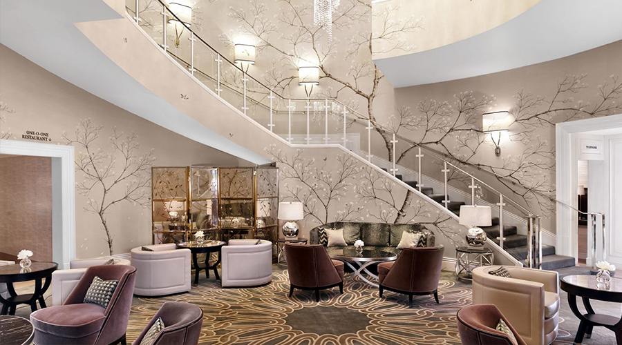
In this example we found, the walls take on neutral, cream-coloured tones punctuated by detailed illustrations of branches of a tree, with darker tones that provide contrast.
Notice how the colour palette of the rest of the room is in union with the design and colours utilised in the wallpaper.
Some furniture like the coffee table chairs have cream, or grey tones, fitting a more neutral range of shades, whilst the carpet, couches, coffee tables and cabinets are upholstered with darker tones, that align well with the darker tones present in the branches of the tree.
Focus on the atmosphere you want to create & how it aligns with your brand and hotel theme
With reference to all the examples we’ve shown you above, the way you approach designing the wallpaper for your hotel lobby is up to you.
It’s best to go for something that’s unique to you as a hotel, or brand, and align it will some of the key areas we’ve mentioned, relating to colour choices, artworks, patterns, contrast and even surface design illustration that adds some first impression value (the maps!). Have a look at our wallpaper collections for some inspiration.
Keep in mind your location, your branded colour palette, and the important aspects of your hotel’s entrance you need to emphasise.
Whether you’re trying to create a warm and welcoming, tranquil, or regal and striking environment, amongst other ideas, the colour and design of your wallpaper will be one of the first things a guest notices when they are about to check into your hotel. So, consider how you can create this feeling and keep the environment fresh and unique.
In need of some expert advice?
Of course, picking all the right pieces to showcase the atmosphere you want to create, is much easier said, than done.
For some expert advice from wallpaper and graphic design professionals on how to structure the design approach for creating an inviting hotel lobby or entrance, contact Robin Sprong Wallpaper to set up a consultation.


2024 Wallpaper Trends: Handpicked Hot Collections by Robin Sprong
From bold patterns to subtle textures, we are taking a closer look [...]
Mar
The Top Interior Design Schools in South Africa
Interior design is an essential function in many industries – its purpose [...]
Mar
5 Pattern Design Trends for 2021
Are you looking for pattern designs that are going to be on [...]
Apr